
Introduction
Ad campaigns are effective when they remind the viewer that they have seen something before, without just being the same thing. We tend to block things out that are always the same. New but familiar will draw us in and keep us there.
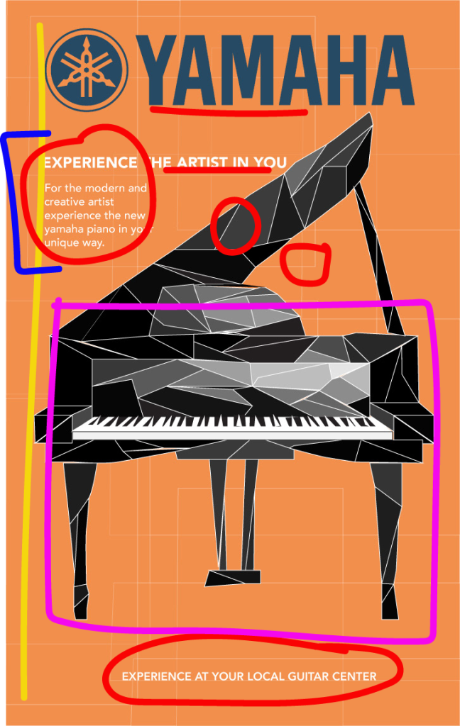
The original ad, featuring the piano on orange, was designed by Rosie Pacheco and can be found at https://rosiepacheco.myportfolio.com/3. The main feature is the piano and the Yamaha brand, and the rest of the design in the ad is used to make sure that it stays the focus while everything else stays a bit more muted. It seems to dare the purchaser to be different with their Yamaha piano.
Original Design
Although they are simple, the design elements of the ad come together nicely.
Alignment (yellow)
The ad as a whole is centered on the page, but the main body of words are aligned on the right. This shows continuity and flow the the words, and an otherwise disjointed picture, and helps everything eye move in usual vertical and horzontal patterns, despite the very crooked lines of the design.
Repetition (red)
The biggest example of repetition is the use of white. It appears as color dividers in the piano drawing, as the color for the main body text of the ad, and as background geometric shapes. Repetition also shows in the typefaces. Everything here is sans-serif.
Contrast (purple)
Contrast is obvious in the drawing of the piano. The shapes that make it up are obviously not what a person is used to seeing. More contrast is found between the lines in the drawing and the lines in the background. The piano lines are all crooked and follow no pattern at all. The background lines are vertical and horizontal.
Proximity (blue)
The main body of the text is all close together and close to the heading. It is very obvious that those words all go together as one complete whole.
Original Color
Color appears here as a complimentary blue and orange in the logo and background. The rest of the colors are different shades on the gray-scale, ranging from black to white. The complimentary blue and orange add depth but no clashing between themselves, allowing the gray-scale to take precedence.
Original Typography

While the typeface choices are not very interesting by themselves, they serve their purpose on this ad. Everything is sans-serif; clean lines, staying vertical and horizontal. This contrasts so well with the crazy lines of the piano design. Depth is added into the typography through different colors (blue and white), different strokes, and different sizes.
New Design
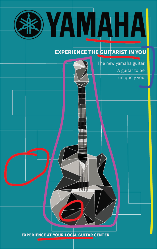
This new design for the ad campaign features a guitar, different colors, and some different design features.
Alignment (yellow)
Once again, the main focus, the instrument and the logo are centered, but the main body text of the ad are aligned, only to the right. This keeps it similar to the original ad but different so as to get the reader to read these new words.
Repetition (red)
Repetition in this new ad is the same as in the original ad. White lines, white typeface, and white lines to break up the shades in the instrument drawing pull the whole space together.
Contrast (purple)
Contrast is also kept very similar to the original ad. The crazy lines making up the guitar are not what one is used to seeing. Those diagonal lines contrast with the vertical and horizontal lines of the background.
Proximity (blue)
Once again the main body of the text is placed close together to make it easy to read. The call-to-action is separate, as if to pull the viewer out of dreaming and into action.
New Color
The color on this new ad keeps things in a simple place. Since most of the previous ad was one color, orange, this ad needed to be a different one. The teal is a split compliment to the orange, so color flows nicely between the two ads. The lines in the background were kept white just like the original ad, as were the gray-scale colors that made up the instrument.
New Typography
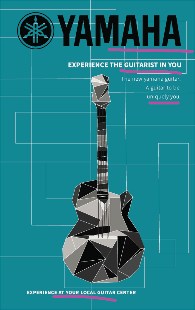
The typography was kept similar to the original ad: all sans-serif with clean horizontal and vertical lines, with contrast found in size, weight, and color. Although the logo type is black instead of blue in this new ad giving contrast, it also provides consistency between the two ads with the same size.
Conclusion
The original ad and the new ad work together for the same campaign because the piano and guitars are made up in a similar manner, the background lines are familiar, as well as the typography. The changes in instrument, background color and logo color give each ad a uniqueness that brings familiarity to the viewer, but also something different, new and interesting to draw them in again.
